Portfolio
SaaS Platform UX Design
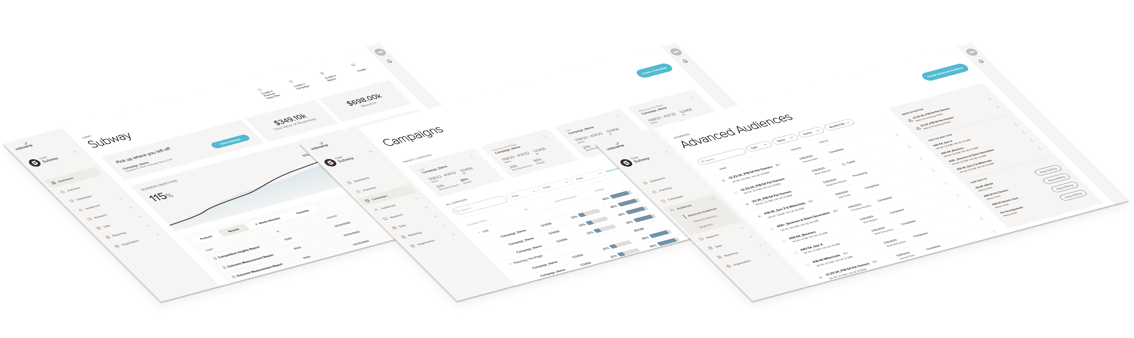
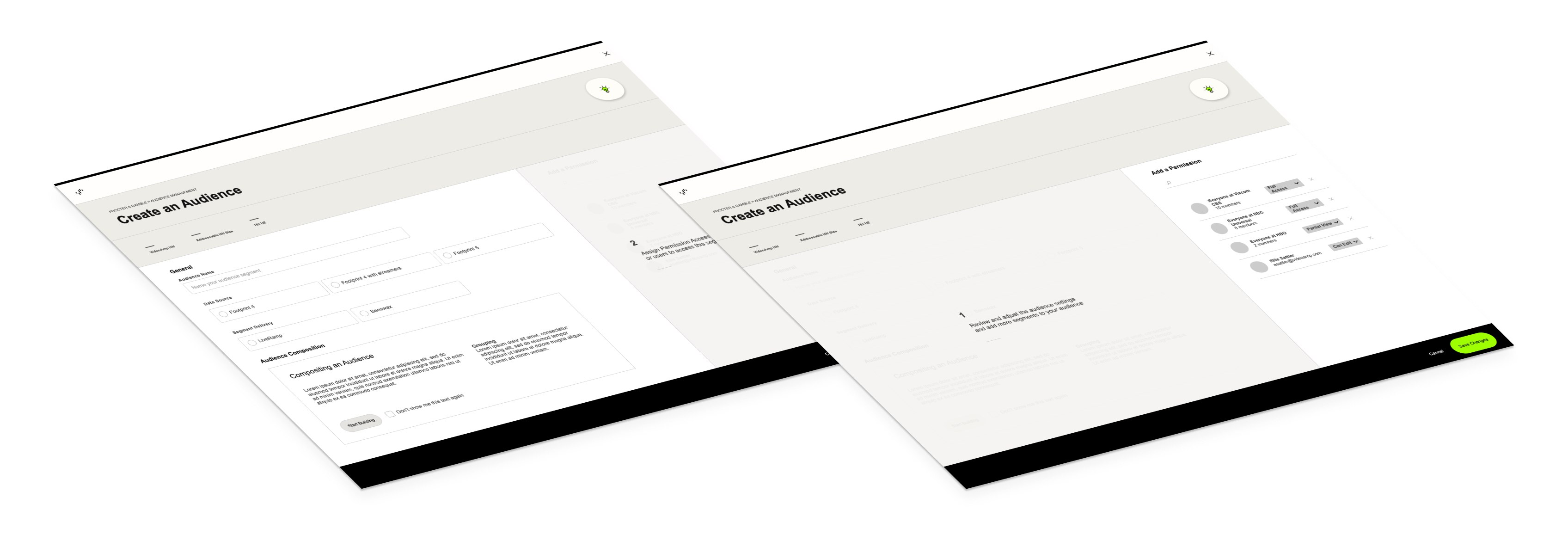
The Project
The User Experience team was tasked with creating a brand new UI for VideoAmp's advertising platform, incorporating new features as well as workflows from multiple previous platforms. A new visual language was created, including a color palette and micro-interactions that would be user tested and included in the design system.
My Role
Workflow Diagrams, Interaction Design, Visual Design, Prototype Development
The Process
The entire team collaborated on updates to the existing design system based on previous user feedback. We then created workflow diagrams that could combine new features with workflows from the existing platform and another legacy platform brought in through an acquisition. The challenge was to create a cohesive platform that could adapt to the needs of several different user personas. Extensive user testing was done with internal stakeholders as well as external clients, utilizing static mockups as well as a high fidelity prototype that I created.
Results
After rigorous testing and iterations, a solid solution that could accommodate all of the required user personas was created. The solution tested extremely well with both internal and external stakeholders who were very excited for the new direction.
Design System & Component Library
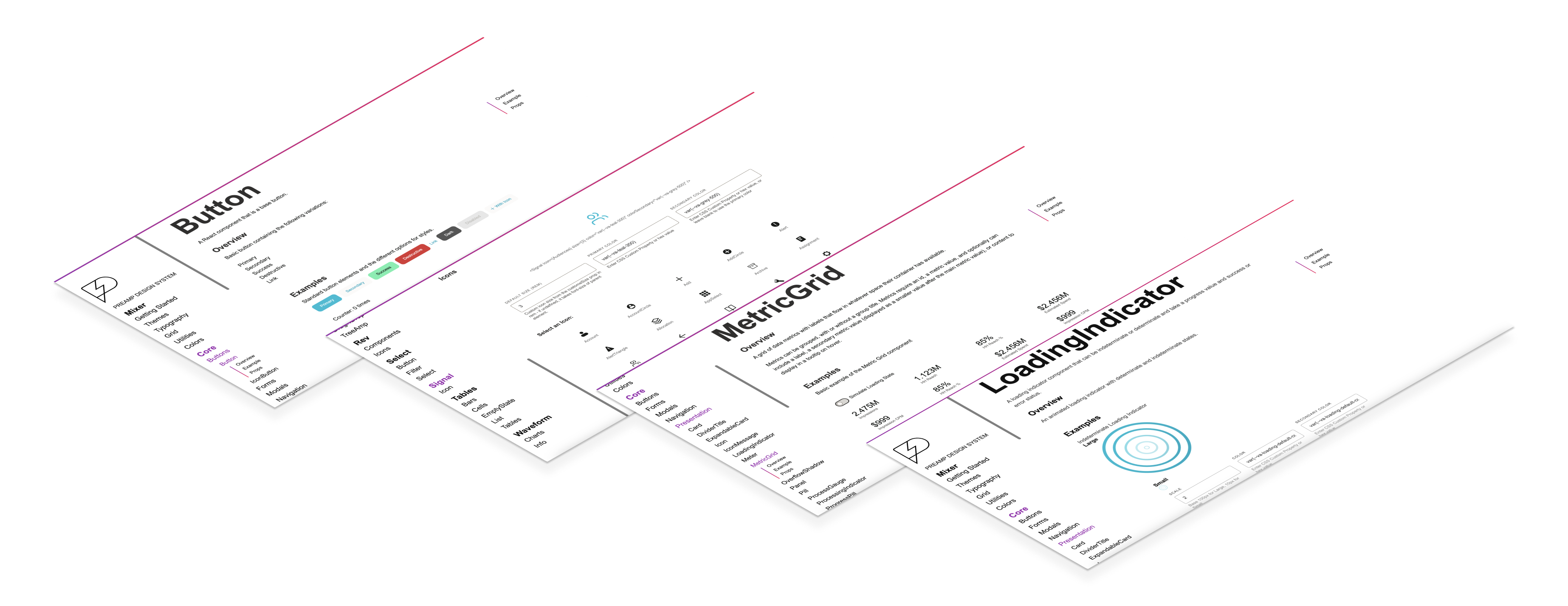
The Project
The creation of a design system and component library is a huge and ongoing undertaking that can span years, but in my opinion is essential to a successful SaaS platform. Not only does it create consistency for the end user, but it also speeds up the process for designers and engineers alike. We set out to create this for VideoAmp's advertising platform to achieve these results. Another goal that we had from the beginning was to make this component library open for anyone to use and eventually contribute to, which meant we wanted to consider not only how we would use these components but also how others outside of our company might use them.
My Role
Design, Documentation, Component Development, CSS Framework, Icon System Architecture and Creation
The Process
Creating a design system and component library has to be a collaborative effort across design, product, and engineering teams. The process started with the UX design team creating paradigms and standards, then driving requirements for components to be added to the library. I was in a unique position as a designer and developer that could help guide the process and facilitate collaboration. From the design side, I helped create and review component requirements and visual designs, created interactions and animations to give components life, and wrote standards and documentation to make implementation of the components seamless. As an engineer on the project, I was a key contributor to creating a scalable and theme-able CSS framework that could utilize design tokens such as font styles, color variables, and other utilities. I also directly contributed to the development with production code for several of the components as well as architecting and creating the icon package to easily include the icon set anywhere in the platform.
Technology used: Sketch, React, HTML, CSS/SASS, GitHub
Results
While it was meant to be an ongoing process, we immediately felt the results by way of increased speed to design and develop new features. End users saw the benefit of a consistent implementation of common standards and paradigms. An additional advantage was gained in that we could utilize the components in the creation of rapid prototypes to quickly test new features and workflows. Because we separated out the CSS framework, we were also able to use it to quickly align the look and feel of an external product, built on a completely different tech stack, that was added to the product suite through an acquisition, with minimal effort.
Design Paradigm for Inline Editing
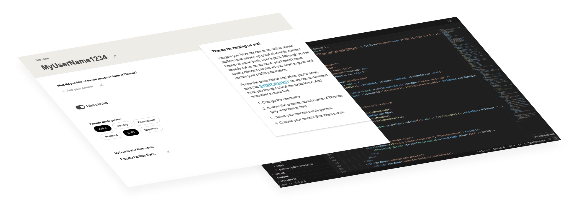
The Project
The User Experience team received feedback from client services that editing objects in the UI was tedious and unintuitive. We set out to create a standard paradigm for editing different fields and aspects of an object without the need to enter a complex edit mode.
My Role
Interaction Design, Prototyping
The Process
I worked with a visual designer and UX researcher to develop the paradigm and a quantitative research plan. The designer came up with a visual design treatment based on a collaborative discussion around options to solve user needs. I then developed a prototype to showcase the interaction with components and worked with the researcher to create a series of tasks that the user would be asked to accomplish. Using Hotjar, we tracked the use of the prototype, giving us quantitative insight into how many users could complete each task. We then referred users to a survey to get their feedback.
Technology used: Sketch, React, HTML, CSS/SASS
Results
Overall, the design paradigm was validated and users gave positive feedback about the ease of use, however we did discover aspects of the initial design that could be improved. The process was also successful because it allowed us to send the prototype and feedback form to a larger number of users since they could complete it at their own pace and didn’t require organizing meetings, taking up valuable time, to review.
Design Paradigm for Focused Workflows
The Project
Looking for a way to simplify complex workflows, the UX team wanted to test some ideas that would allow users to focus on smaller chunks of a workflow at a time.
My Role
Interaction Design, Prototyping
The Process
I worked with another designer to concept ideas for simplification. I then created a prototype that could be put in front of users to see how well our crazy ideas would be received.
Technology used: Sketch, React, HTML, CSS/SASS, Hotjar
Results
Sometimes you can have a really cool idea that just doesn’t resonate with your users. As designers, we can create an innovative concept that just might not be the right solution for the audience and how they prefer to work. This was one of those times. While I really like the concept, the experimental paradigm was not something we went forward with. I consider this a success as we did learn a lot from our users and facilitated deeper conversations around less drastic solutions to the complexity issues they were facing. We learned this without spending the time and resources updating the platform and building the wrong thing for our users.